I hope everyone had a great weekend! We got a lot accomplished over the weekend, including our "Meet the Addicts" page, so if you get a chance, stop over and get to know us a bit more!
If you've been following my blog, you might remember that my friend Lori recently asked me to decorate her foyer. She even offered to hand over her credit card and just let me buy whatever I wanted, which was very tempting, but I thought it would be fun if we shopped for everything together. Lori and I don't have the same style in home decorating, so I was honored that she trusted me to help her decorate.
If you've been following my blog, you might remember that my friend Lori recently asked me to decorate her foyer. She even offered to hand over her credit card and just let me buy whatever I wanted, which was very tempting, but I thought it would be fun if we shopped for everything together. Lori and I don't have the same style in home decorating, so I was honored that she trusted me to help her decorate.
Here is her foyer currently:
I've been thinking about her foyer for a couple of weeks now. I know she wants it to be a formal entry and she's mentioned that she wants a black console incorporated into the design. She has even picked out a piece of artwork that she likes, so I have some ideas to work with. I've been looking around for items that I think will look nice, so the plan is this Saturday, we are going to go shopping together so I can show her some of my suggestions.
I know how stressful decorating entries can be. I just made the big decision to paint my door, banister and stairs black.
Your entry foyer is extremely important because it's the first thing people see when they enter your home. It sets the stage for what type of home you have.
In thinking about Lori's foyer, I've found that many foyers have three similar elements.
1. A table, Console or Bureau
2. Artwork, Mirrors, or clocks
3. A place to sit
Here are a few foyers I found that offer an example of these elements.
Delores, over at Vignette Design just spruced up her entry and she incorporates all of the above-mentioned elements. I love her wicker seating with the European feed sack pillows and the seagrass rug adds an element of texture.
This foyer offers all three elements, a table with a clock hanging directly above it, and a bench. The shadow-box trim and the runner up the stairs make the space more formal.
Photo: Better Homes and Gardens
Photo: Better Homes and Gardens
Again, we see the three elements in the next photo: a clock, bureau and chair. I like the antique bottles!
Photo: Houzz.com
The next traditional entry uses a card-catalogue type console to display candles, a picture and a beautiful vase filled with a touch of the outdoors. This console offers an open space beneath it for baskets.
This clean, crisp foyer displays a topiary and an orchid atop the console. Notice the mirror above the console which reflects the light provided by all of the windows. I really like the baskets placed next to the door.
Here, the staircase takes center stage. The round end table fits nicely with the curve of the staircase.
And finally, I love all the creamy whites in the next photo. The enormous clock on the stair wall is gorgeous and completes the shabby chic decor.
What about all of you? Which of the above foyers do you like and why? I'd love to hear your comments.
If you have a foyer that you'd like to share, please email pictures of it to me! We need as many ideas as we can get before Saturday!
Finally, if you get a chance, stop over to This Old House and check out our submission for "Before and After" home remodeling contest. Don't forget to rate the remodel! For more "Before and After" pics, see the "Our Fixer Upper" page.


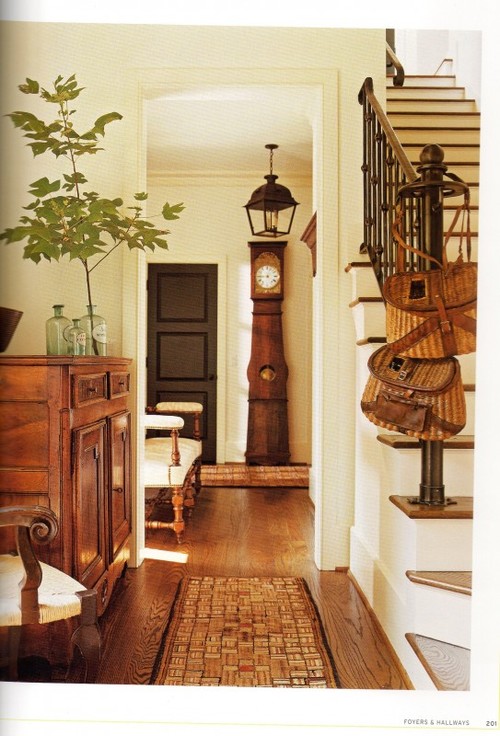
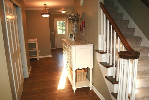
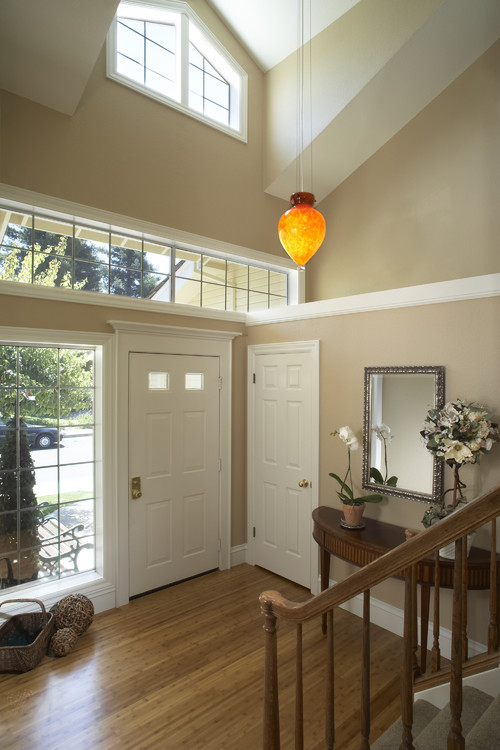
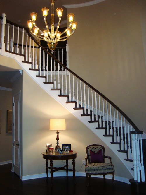


I love the better homes and garden one and the traditional staircase design by los angeles interior designer Elaine Morrison Interiors (Houzz). These 2 are my favorite and I think would work the best for Lori. I love the elegance of both of these.
ReplyDeleteStephenie,
ReplyDeleteThe Better Homes & Gardens photo with the picture hung over the bureau looks much like the front entrance to the Fairfield House. It's not a true foyer more a center hallway. We have a HUGE antique (1800s) mirror hanging on the wall opposite the stairs.
I think your friend is wise to ask your assistance with design. I look forward to watching the process!
Deborah
Hi there! Thank you so much for stopping by and for the congratulations for being on TLC. I loved your mantel as well!! :O)
ReplyDeleteI love your blog, I think I am going to have to add you to my blog list! :O)
Have a great week!!
Kelly
Oh, btw.... I guess beth stopped the mantel party unfortunatly.
ReplyDeletehttp://bethcrabtreehunter.blogspot.com/2010/03/ready-set-vignette-party-announcement.html
I think I request she do one 4 times a year (spring, summer, fall, winter). I really enjoyed it.
Another blog I love just started a monthly favorite diy party. You, might like to check it out....
http://beneathmyheart.blogspot.com/2010/03/well-today-is-day-i-am-going-to-make-my.html
Some great ideas here. I especially liked the first photo. I think the use of color and the touch of European decor that the chair brings. Lovely!
ReplyDeleteThe best thing about blogs is all the fabulous sharing of ideas. The worst thing...foyer and mantel envy!! My townhouse is small and I have neither of these things (pout!) If I had a foyer though, I'd love the last one...those clocks are gorgeous. I agree with Mrs KBJ...on the blog roll you go!
ReplyDeleteMy poor foyer is a catch all right now. This post makes me want to bring it back to life. Thanks~
ReplyDeletei think that Lori's foyer needs some color, or some texture for warmth - that's the one thing she seems to be missing that all the others have. the all white seems too sterile.
ReplyDelete